5 App Demo Videos Done Right (Examples) + Tips
Table of Contents
- What Are App Demo Videos?
- 5 App Demo Videos That Were Done Right
- #1. Google Translate
- #2. Slack
- #3. IKEA Place
- #4. DuoLingo
- #5. Moodcaster
- 5 Practical Tips For Making An Effective App Demo Video
- #1. Know Your Audience
- #2. Keep It Short And Simple
- #3. Prepare A Script
- #4: Include A Clear Call-To-Action (CTA)
- #5: Set Up A Distribution Plan
- Key Takeaways
Mobile app descriptions and screenshots are great at convincing potential users all right, but it’s app demo videos that ultimately make the biggest difference.
You see, as it turns out, more than 25% of App Store and Google Play users admit to “rarely” or “never” reading the text description before proceeding to download an app. They, instead, prefer to base their decisions on mobile app demo videos and the corresponding ratings and reviews.
So hooked are people, in fact, that 75% of them claim that videos are the best way to learn how a mobile app operates – while only 18% lean towards screenshots, and 7% tend to rely on written text descriptions.
So, whichever way you look at it, the app demo videos rule!
And get this – that doesn’t apply only to the App Store. Rather, app demo videos are extremely impactful even in other app distribution channels and digital marketing platforms. I’m talking about social media, YouTube, email, etc.
Regardless of where you end up posting your product demo video, it just so happens that 86% of people are more likely to download the app after watching its demonstration video.
Don’t get too carried away, though. While app demo videos have collectively proven to be much more engaging than other forms of media, it’s not just any random video that’ll work well for your mobile app. A typical smartphone user has, by now, seen thousands or probably millions of product demo videos, and they know how to discern between great videos and poor ones that are worth nothing.
What does that mean for you?
Well, the thing is, you either learn the art of making effective app demo videos or forget about driving conversions from videos.
Now, to help you with that, this guide walks you through:
- What an app demo video is.
- 5 examples of app demo videos that were done right.
- Important lessons to pick from successful product demo videos.
- 5 valuable tips on how to make an effective app demo video.
- All the basic stuff that goes into creating an impactful promo video.
What Are App Demo Videos?
As we’ve established already, app demo videos are not restricted to the Apple App Store and Google Play Store. An app demo video is any promo video that seeks to introduce your app to customers, and then explain how it works.
You can think of it as more of a product demonstration video that communicates your app’s value to potential customers In other words, they get to see the mobile app in action, and subsequently, learn how it feels to use it.
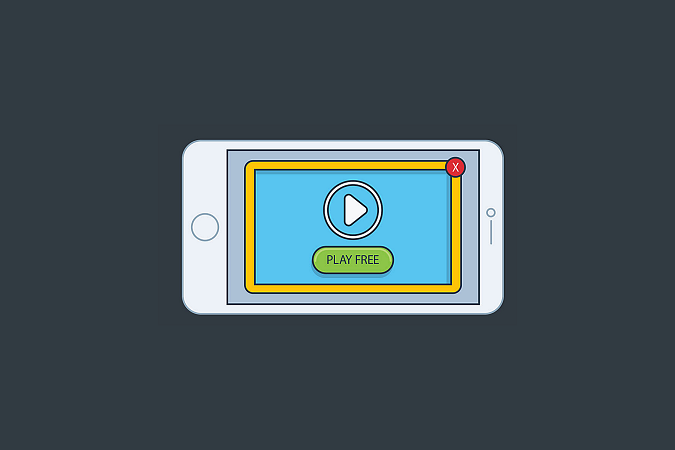
Don’t get me wrong, though. Not all product videos are demo videos. While product videos generally come in many different forms – like entertainment videos, team introduction clips, etc – demo videos tend to focus on the practical bit of using the mobile app.
As such, app demo videos play a very critical role in the customer journey. Once prospects have identified their problem and learned about possible solutions, it’s the demo videos that ultimately provide proof and reassurance about the purchase decisions they’re making.
Now, that explains why 83% of individuals believe that watching a demo video helps them make a more informed decision when considering whether to download an app or not. They particularly prefer app demo videos that acknowledge their main user challenges, and then proceed to highlight how the app’s features provide a solution.
Well, I must admit, that’s no easy thing to execute – especially when you intend to publish the demo videos on the app stores. On the Apple App Store, for instance, demo videos are known as “App Previews”, and they are usually subjected to quite a number of rules.
For example – you’re required to compress everything into a video that doesn’t stretch beyond 30 seconds. What’s more, the video content itself should not show people interacting with the app, or maybe behind-the-scenes footage of the app’s development. You’re, instead, expected to focus on just the app – using a screen recording, or perhaps an animation that demonstrates how it all works.
5 App Demo Videos That Were Done Right
Here are 5 solid examples of app demo videos that, in our opinion, were done right.
Each of these product demo videos managed to resonate quite extensively with its viewers across various digital platforms.
#1. Google Translate
By the time the Google Translate app was introducing its “Tap to Translate” feature in 2016, it had been around for a decade or so. But, despite the app’s extensive popularity – boasting more than 500 million users by April 2016 – Google saw the need to create an app demo video for the new feature.
Why is that?
Well, quite simply – the product demo video was meant to connect with app users and, in a relatable manner, explain how the “Tap To Translate” feature works.
Now, instead of using a boring screen recording, the video production team at Google chose to create an engaging animated video. The app demo video starts with a straightforward problem statement and then throws in very basic but quirky animations to illustrate the solution.
Meanwhile, a charming voiceover artist explains just how “Tap To Translate” allows users to seamlessly run translations through Google Translate while they’re using other apps.
By combining a relatable problem statement with interesting graphics, a calm voiceover, and playful background music, the app demo video manages to quickly grab the attention of viewers and keep them engaged to the end. The problem itself resonates very well with the viewers and then keeps them attentive long enough to discover the benefits of the “Tap To Translate” feature.
Subtly done, yet exciting and very impactful. A minute and twenty seconds is all the demo video takes to walk you through the basics of “Tap To Translate”.
Key Lesson: Introduce the problem statement to hook your viewers, and then walk them through the solution and its benefits.
#2. Slack
The goal of this product demo video is seemingly to debunk the common misconception that Slack is only a private messaging app.
To achieve that, the video production team used motion graphics, screenshots of the app, bright colors, a voiceover, background music, and a human actor to explain the app’s key features.
The center of attention, however, is Brianna, the actor. She rises above the rest of the layers to connect with the audience at a personal level, which then lays the groundwork for explaining all the benefits that slack offers.
Brianna doesn’t just jump into the features, though. Instead, the voiceover artist cleverly interacts with her to make the persona appear like your average friendly neighborhood girl who happens to use Slack.
“You’ve probably heard of Slack,” the app demo video begins. “…your friend, Brianna from soccer practice, told you about it,” it continues, as the voice actor tries to establish a connection between Brianna and the viewers.
Then as you begin opening up to her, the video throws in popping colors in the background to subconsciously get you excited and maintain engagement.
For the next one and a half minutes or so, Brianna proceeds to explain how she uses Slack – with the help of the voiceover artist, plus basic motion graphics.
By the time viewers get to the end, the app demo video has got them feeling like they’ve been recommended Slack by a friend.
Key Lesson: Give your viewers a persona they can relate with.
#3. IKEA Place
Released in September 2017 by world-famous furniture maker IKEA, IKEA Place is an augmented reality app that helps users visualize how various furniture pieces would fit into their spaces.
This specific app demo video dropped around that time – just as they were launching the app. Its primary objective was to introduce potential users to the whole concept. That’s why, in fact, it begins with “Hey, IKEA would like everyone to know about Place – our new augmented reality app.”
What follows is bright and upbeat video content that demonstrates how to use the app from the first-person point of view – complete with a phone screen in some of the shots.
It doesn’t stop there, though – in contrast to Google Translate’s approach of placing the problem statement at the beginning, IKEA Place chooses to drop its problem statement right after introducing the app and its usability. This is subsequently followed by a brief demonstration of the benefits, which cleverly highlights why the company developed the app.
That said, the secret to this video’s success is IKEA’s blunt illustration of the app’s application in real-life. You get to see how you’ll use it across different types of homes and with various pieces in furniture – while the actors do a fantastic job of depicting real-world scenarios.
Key Lesson: Use practical real-life scenarios to make the app relatable.
#4. DuoLingo
While Google Translate, IKEA Place, and Slack are a bit heavy on voiceovers, the truth of the matter is, it’s still possible to rally audiences without any sort of voiceover script.
Case in point – this product demo video was recently published by Duolingo, a mobile app that uses gamification to teach its users foreign languages.
In the demo video, the app touts itself as “The most fun way to learn a language”, which happens to be Duolingo’s value statement. This is what it chooses to start off the video with.
Now, to be specific, Duolingo’s app demo video is a combination of text explaining the value and features you should expect from the app, a screen recording illustrating the corresponding functionalities, plus funky music in the background.
Then to capture the attention of viewers, Duolingo throws in a spirited animation of its mobile app logo. It’s this toon character that playfully follows you around in the background while Duolingo demonstrates its value.
Pretty simple but alluring, I must say. And it’s all cleverly executed to communicate the core value of the app within 30 seconds.
Key Lesson: Keep it simple and straight to the point.
#5. Moodcaster
Fifth on our list of the best app demo video examples is Moodcaster, a recently launched talent casting platform. It essentially helps actors audition for roles from their mobile devices, as well as collaborate extensively with other talents and casting professionals.
The approach the platform took with its app demo video is a bit interesting because it integrated pretty much everything you can think of, and still managed to achieve a perfect balance.
Here, you’ll find layers of app screenshots, bold animations, various screen recordings, groovy music, multiple sound effects, and even an actor demonstrating the real-life application of the application. Then get this – the animated video still manages to cover both the web and mobile app versions of the Moodcaster.
So, I guess you can call it an all-inclusive product demo video – the only thing missing is a voiceover. Other than that, it’s a cocktail of all the basic demo video elements.
Ok, I’ll admit that this might be a risky approach. Combining as many elements could easily backfire on anyone. But, Moodcaster has thoughtfully found a way to place them in a manner that they supplement each other while keeping the message clear.
The app demo video itself is exactly what you’d expect from the entertainment industry – bold, colorful, exuberant, and exciting. So much so that it almost feels like a pop music video.
It first ushers you in with a problem statement, introduces the app, and then proceeds to showcase the platform’s applications and the overall value they offer. The screen recordings here are particularly captivating, as Moodcaster creatively superimposes them onto each other to create eye-catching strings and layers of the app’s interface.
So, admit it – the whole thing kinda hypes you up to try out the app. It even almost gets you dancing.
Key Lesson: Don’t be afraid to go bold.
5 Practical Tips For Making An Effective App Demo Video
If you’re looking to create truly captivating app demo videos that’ll effectively rally your audience, here are five important tips you might want to apply:
#1. Know Your Audience
Start by figuring out the type of audience you’re targeting with the product demo videos. And while you’re at it, try to also define the problems that the app will be solving for the viewer.
This is where, for instance, you ask yourself about the demographic, needs, and position of your target app video viewers.
What buyer persona do you intend to reach out to? On which platforms will you find them? What are their primary concerns? Have they heard of your mobile app before, or are you planning to introduce a totally new product?
Then when it comes to shooting the app demo videos, you need to have a good idea of what connects best with your audience – based on the app’s context.
Gaming and entertainment-based mobile apps, for instance, can have fast-paced demo videos with a lot of popping graphics and animations. Then demos for dating apps, on the other hand, tend to be a bit laid back, while focusing more on the prospects of finding long-term partners.
#2. Keep It Short And Simple
The goal of an app demo video is to briefly introduce the app and maybe communicate its value. That’s it. You could choose to approach the value bit using benefits over a corresponding problem statement, or perhaps an illustration of the app’s core features. Whatever you choose, ensure that you keep it all short and simple.
Well, come to think of it, you don’t even have much of a choice on the two main app stores – as the Apple App Store restricts you to 30 seconds, while Google Play Store doesn’t go beyond 2 minutes. Otherwise, when it comes to other digital platforms (including social media), you have the freedom to stretch out the app video length a little bit further.
The standard length for most app demo videos is about 60 to 90 seconds, although you’re allowed to go up to five minutes. Anything beyond, however, that is considered to be more of an app tutorial video.
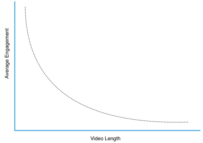
That said, it’s worth noting that the average attention span when watching online videos is 60 seconds. And, as you’d expect, shorter videos tend to keep viewers engaged for far much longer than lengthy videos.
#3. Prepare A Script
Even when you’re creating an extremely short product demo video, you still need a script. This is what will ultimately define the message, pace, and tone of your entire video.

But, how exactly do you even prepare a video script?
Well, you could start by creating a project brief, plus an outline of what you intend to achieve with your app demo video. You could then forward these details to a professional scriptwriter, who’ll prepare a comprehensive video script that covers all the aspects.
A solid video script should, in the end, be very convincing and powerful. Additionally, ensure that yours stays on track, providing only the product information that’ll rally your viewers to download the app.
#4. Include A Clear Call-To-Action (CTA)
Don’t assume that your audience knows the steps to take after watching a compelling app demo video. Even for demo videos that you intend to publish on the App Store, remember to provide a clear Call-To-Action based on your specific campaign goals.
You could, for instance, call on your audience to download a free trial of your mobile app, purchase it, or join the prelaunch signup list. The choice is all yours.
Also, feel free to place the CTA anywhere within the video – at the beginning, in middle, or possibly at the end.
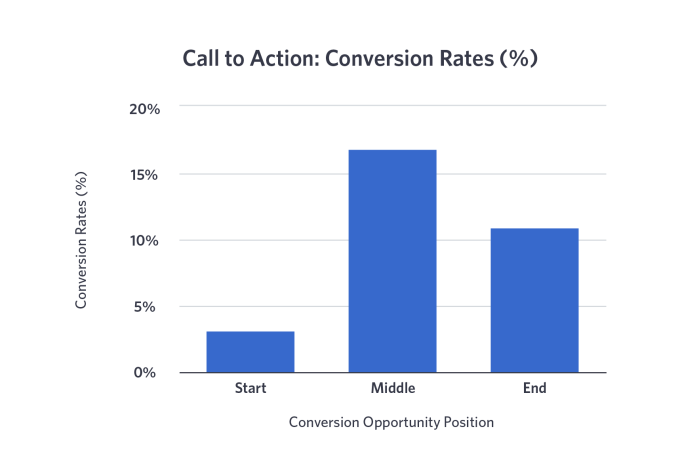
Please note, however, that while most marketers choose to have their CTAs at the end of the video – 95.9% compared to 4% for mid-rollers, and 0.1% for pre-rollers – it’s the middle-placed CTAs that eventually generate the highest conversion rates.
They tend to register, on average, a conversion rate of 16.95%, while post-rollers come second with 10.98%, and pre-rollers last with 3.15%.
#5. Set Up A Distribution Plan
Having multiple video distribution channels is a good thing, but it could also translate to a lot of extra tweaks on your part.
You see, the problem is, digital platforms handle videos differently. The Apple App Store, for instance, has strict guidelines on how you should set up your app demo videos. The same applies to the Google Play Store, while social media platforms like Facebook and YouTube happen to be a bit more versatile.

These guidelines and restrictions apply to pretty much everything – from the video content itself to the size, format, length, and resolution of the videos.
As such, you should establish distribution channels early enough, and then come up with app demo video formats that are in line with the respective channel guidelines.
If you’re seeking to publish an app demo video on your Instagram feed, for example, you might want to proceed with a 1:1 screen layout. Then for Instastory product demo videos, you’d be better off with a layout of 9:16.
Key Takeaways
To Recap:
- More than 1 out of 4 App Store and Google Play users admit to “rarely” or “never” reading the text description before proceeding to download an app. They, instead, prefer to base their decisions on mobile app demo videos and the corresponding ratings and reviews.
- 75% of people claim that videos are the best way to learn how a mobile app operates – while only 18% lean towards screenshots, and 7% tend to rely on written text descriptions.
- 86% of people are more likely to download the app after watching its demonstration video.
- An app demo video is any promo video that seeks to introduce your app to customers, and then explain how it works. Think of it as more of a product demonstration video that communicates your app’s value to potential users.
- While product videos generally come in many different forms – like entertainment videos, team introduction clips, etc – demo videos tend to focus on the practical bit of using the mobile app.
- 83% of individuals believe that watching a demo video helps them make a more informed decision when considering whether to download an app or not.
- On the App Store, you’re required to compress everything into an app preview video that doesn’t stretch beyond 30 seconds.
- By combining a relatable problem statement with interesting graphics, a calm voiceover, and playful background music, the Google Translate app demo video manages to quickly grab the attention of viewers and keep them engaged to the end.
- Slack’s demo video persona connects with the audience at a personal level, which then lays the groundwork for explaining all the benefits that slack offers.
- The secret to this IKEA Place’s video success is its blunt illustration of the app’s application in real-life. You get to see how you’ll use it across different types of homes and with various pieces in furniture – while the actors do a fantastic job of depicting real-world scenarios.
- Duolingo’s app demo video is a combination of text explaining the value and features you should expect from the app, a screen recording illustrating the corresponding functionalities, plus funky music in the background, along with an animated mascot.
- Moodcaster thoughtfully found a way to place its many video elements in a manner that they supplement each other while keeping the message clear.
- Start by figuring out the type of audience you’re targeting with the product demo videos. And while you’re at it, try to also define the problems that the app will be solving for the viewer.
- The standard length for most app demo videos is about 60 to 90 seconds, although you’re allowed to go up to five minutes. Anything beyond, however, that is considered to be more of an app tutorial video.
- The average attention span when watching online videos is 60 seconds. And, as you’d expect, shorter videos tend to keep viewers engaged for far much longer than lengthy videos.
- Create a project brief, plus an outline of what you intend to achieve with your app demo video. You could then forward these details to a professional scriptwriter, who’ll prepare a comprehensive video script.
- Although most marketers choose to have their CTAs at the end of the video – 95.9% compared to 4% for mid-rollers, and 0.1% for pre-rollers – it’s the middle-placed CTAs that eventually generate the highest conversion rates. They tend to register, on average, a conversion rate of 16.95%, while post-rollers come second with 10.98%, and pre-rollers last with 3.15%.
- You should establish distribution channels early enough, and then come up with app demo video formats that are in line with the respective channel guidelines.
Conclusion
And there you have it. You can now consider yourself informed, and in a much better position to come up with a decent plan for your mobile app demo videos.
Way to go!
If you soldier on, though, you’ll ultimately realize that learning these industry best practices is one thing, while implementing an effective app demo video is quite another. It takes a special set of mobile app marketing skills and a keen eye for detail to plan, create, publish, and track truly impactful app demo videos.
Luckily for you, you’ve got PreApps on your side. As a mobile app marketing agency that has been in the business for more than a decade – within which we’ve worked with more than 3,300 apps – we’ve learned all there is to know about product demo videos. So, you can count on us to apply tried, tested, and adequately proven tactics on all your demos, as well as marketing videos.
Want to see it all in action? Just get in touch with us today, and let’s talk about your app growth plans.
Newsletter
Don’t miss a thing! Sign up to receive daily news
Subscribe Newsletter


