Landing Page Versus Website For App Marketing
Table of Contents
- Overview
- What Is an App Website?
- What Is an App Landing Page?
- 4 Main Differences Between an App Landing Page and an App Website
- #1. Goal/Audience
- #2. Navigation Links
- #3. Content
- #4. Call To Action (CTA)
- Usage
- When To Use a Mobile App Website
- Build SEO
- Create Awareness Pre-Launch
- Engage App Users Post-Launch
- Circumvent App Store Limitations
- When To Use a Mobile App Landing Page
- When To Use a Mobile App Website
- App Website and App Landing Page Components
- What You Need On An App Website
- What You Need On An App Landing Page
- Conclusion
App landing pages versus websites. One of the biggest debates in the mobile app marketing scene.
On one hand, we have guys who believe that you don’t really need to supplement your app store listing with a landing page or website. Then on the proponents’ side, it turns out there are two popular beliefs.
Some argue that you need to separate your mobile app landing pages from the website, and then there are those that trust their app websites to play the role of landing pages.
Confusing?
Well, that’s understandable, I must admit. While the role of the app store listing pages is pretty clear, things start to get a bit confusing when it comes to mobile app landing pages and websites.
In particular, app developers and publishers would want to know:
- What’s the difference between an app landing page and an app website?
- What’s the role of mobile app landing pages and websites?
- When should you use an app landing page?
- When should you use a mobile app website?
- Where do you place app landing pages?
- What should you include in a mobile app landing page?
- What should you have on your mobile app’s website?
To get the answers, I encourage you to read along as I provide data-backed insights into both mobile app landing pages and websites. This comprehensive guide is based on my 10+ years of experience in mobile app marketing, through which I’ve had the chance to test out all sorts of app landing pages and websites.
So, here’s the truth and nothing but the truth about a landing page versus a website for app marketing.
Overview
Although some marketers are fond of using these terms interchangeably, the truth of the matter is, a landing page is very different from a website.
And, in case you’re wondering, both are extremely important to your mobile app marketing campaign. Take it from a professional who has worked with more than 3,250 mobile apps across various categories.
Now, with that out of the way, what exactly is a mobile app landing page? And how is it different from an app website?
Here are the basic definitions of both…
What Is an App Website?
An app website, for starters, is a collection of linked app-related web pages that share a common domain name.

You can, for instance, have an app website that comprises:
- A “Home” page.
- An “About” page.
- An “App Features” page.
- A “Download App” page.
- A “Contact Us” page.
- A “Customer Reviews” page.
- A “Blog” page.
Although each of these pages serves a different purpose, all of them are meant to work together towards promoting your mobile app business. Visitors get to learn more about your mobile app and the entire business by navigating through the pages.
So, in other words, you can think of your app website as the central operating base of your mobile app business.
What Is An App Landing Page?
While a landing page technically happens to be a form of a web page, it doesn’t operate like standard web pages. Instead, landing pages are built specifically to host visitors who’ve been redirected by an ad.
They are not for exploration, though. Rather, a post-click landing page is intended to convert visitors immediately they land on your website from an ad – like sponsored social media posts, QR codes, etc.

As such, you could say that all landing pages are web pages, but not all web pages are landing pages.
That’s why you won’t even find navigation links on landing pages. Their job is just to provide brief information and convert, without directing visitors to other web pages.
You can, for instance, use your app landing pages to drive signups or app downloads from prospects.
And no, don’t make the common mistake of confusing between app landing pages and app store listing pages. An app landing page is a completely independent entity that runs separately from the app store.
4 Main Differences Between An App Landing Page And An App Website
#1. Goal/Audience
Once you build an app website, you get to host all sorts of visitors. While some might be prospects seeking to learn more about your business, others could be your app users returning to seek customer support, or maybe blog followers interested in your content.
As such, it’s increasingly difficult to predict the journey of each visitor. So, to play safe, most app websites are built with multiple web pages that simultaneously serve the interests of different visitors.
Now, consider the website angrybirds.com, for example. This is the home of the famous “Angry Birds” apps, which have so far attracted billions of downloads from both iOS and Android users.
The website itself is quite dynamic, as it facilitates multiple user journeys and goals at the same time. From the menu options, alone, you can tell that this site hosts not only app users, but also movie enthusiasts, and online shoppers.

Now, when it comes to post-click landing pages, you can bet you won’t be dealing with such diverse audiences. Every single visitor who finds their way to your app landing page is essentially a warm lead responding to a promotion campaign. They come because they’re already considering claiming your ad offer.
That means you only have one goal – to convert the visitors. This is not where you’d want to have multiple navigation links – since they would only lead the visitors away from the conversion process.
You should, instead, keep it brief and straight to the point. For instance, you could highlight the app’s features, provide a couple of convincing testimonies, and then tie it all to a relevant “CTA”.
So, in other words, you could say an app landing page is campaign-specific. How you choose to design it depends on what you intend to achieve in your app promotion campaign.
In fact, as it turns out, 48% of digital marketers today create a new landing page for each new campaign. They just fire up their landing page builder and customize the landing page templates based on their specific campaign goal.
In the case of “Angry Birds”, for example, you’d be expected to direct leads to a landing page that looks something like this – instead of leading them to the website’s homepage.
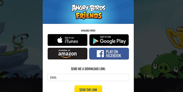
This should help in converting leads as soon as they land on the page. They just need to pick their app download source and voila! It’s that simple and straightforward.
#2. Navigation Links
To effectively facilitate all the audience goals, an app website should find ways of interconnecting its web pages with navigation links. This allows visitors to seamlessly move around the site as they seek to accomplish their different goals.
For example – still, on the “Angry Birds” website, you’ll find multiple navigation links within the header and footer.

The “Games” option within the main menu, for instance, will direct you to the Games page, from where you can download different versions of the “Angry Birds” apps, or alternatively play them online. Other than that, you could proceed to the “Movie” section to access the “Angry Birds” movie, or maybe click on “Shop” in case you’d want to check out the available merchandise.
And speaking of which, the shopping area here even comes with sub-menu options that allow you to switch between different item categories. You could sample the “New” stuff, “Toys and Games”, “DVD & Blu-Ray”, “Apparel and Accessories”, as well as “Collectibles”.
What’s more, the website allows you to navigate to Angry Birds’ official social media pages. On the top right corner of the header are Facebook, Twitter, YouTube, and Instagram buttons. Then on the page footer, you get links to the Angry Birds blog plus the customer support page.
Whichever you choose, you should be able to move back and forth across the entire website using just the navigation links.
That is the norm with app websites. Even their web page templates come with multiple navigation links by default.
As for app landing pages, however, it goes without saying that navigation links could potentially compromise your overall conversion rate.
You see, the thing is, warm leads hate to be bombarded with fluff – and that includes even links to additional offers. Placing multiple offers here could potentially reduce your conversions by 266%.
And no – although it’s tempting, don’t make the mistake of providing links to your app’s social proof. That would be counterproductive.
Generally, an app landing page only publishes links within the CTA button. You could direct your leads to your app store page, or perhaps give them the chance to download the app directly
Take a look at this Adobe Acrobat landing page, for instance.
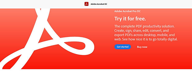
This is what you’ll see when you click on the “Adobe Document Cloud” Facebook ad. Just two links are embedded in the CTA buttons.
#3. Content
As you’ve probably figured out already, there are no rules to the type and amount of content you could have on your app website.
In fact, the more content you build over time, the faster your web traffic and the following will grow. 70% of people say they’d rather learn about a company or business organically from an article or blog post, instead of a traditional ad. What’s more, 72% of digital marketers have proven that content marketing does indeed increase lead generation and engagement.
When working with landing pages, however, you might want to cut back on the amount of content. An app landing page should only provide brief details about the app that you’re trying to promote.
The content should, in particular, be optimized for the specific campaign you’re running.
For example, if your Facebook ad manages to win leads over by showcasing the type of partners they’re bound to meet through your online dating app, the landing page should pick up from there and expound further on the matter.
This is where you could, perhaps, provide brief details about the app’s intelligent profile matching capabilities, and maybe highlight one or two couples that met thanks to that.
Avoid going overboard with the features, as most leads don’t even bother reading the finer details. 80% of your visitors will readjust the headline, while only 20% will proceed beyond that to peruse through the content body.
Consider, for instance, this post-click landing page template from Envato Market.

The image showcases the app’s UI, the bold headline captivates the reader, while the two lines of text summarize the value of the app.
Pretty neat and effective, I must say. It even gives you a video link in case you’d like to learn more about the app.
#4. Call To Action (CTA)
Call To Action (CTA) is yet another critical discerning factor between an app landing page and an app website.
You see, all landing pages are centered around specific actions. They’re built to convert leads by convincing them to proceed with the actions – which, in the case of mobile apps, could be downloading the app, or perhaps pre-registering ahead of the app’s launch.
The Call To Action itself typically comes in the form of a CTA button, which should be simple, clear, and understandable.
Here’s an example of a standard CTA button from another Envato Market app landing page template.
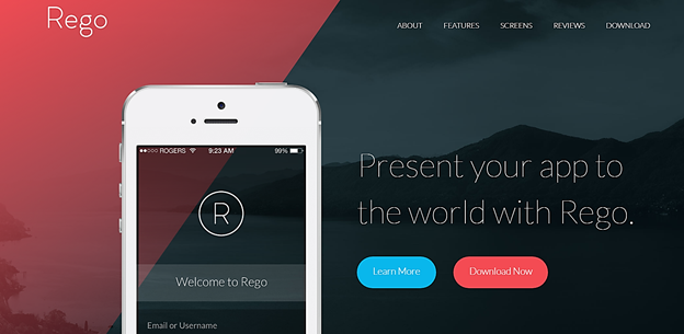
Once you open the page, you’re greeted with two prominent action-oriented buttons – “Learn More” and “Download Now.
To make yours even more appealing, though, you might want to bundle the CTA with a unique offer. For example – if you intend to drive app downloads, a basic “Download Now for 10% Off” button should do the trick.”.
App websites, on the other hand, are not necessarily required to have CTAs. In most cases, the Call-To-Action buttons are reserved only for the conversion pages that come last in the sales funnel. That’s because websites tend to focus more on informing and nurturing, as opposed to lead conversion.
Usage
Now that we’ve established the principal differences between app websites and app landing pages, it’s only right to clarify their corresponding use cases.
So, here’s a breakdown of how you should leverage mobile app websites and mobile app landing pages:
When To Use a Mobile App Website
#1. Build SEO
Considering 68% of online experiences begin with a search engine, you cannot afford to leave SEO out of your mobile app marketing war chest.
Yeah, of course, you could also use Google Search Ads and whatnot. But, get this – SEO will always be king, as 53.3% of all website traffic comes from organic search.
App websites are particularly ideal for this job, since they offer plenty of search engine optimization opportunities.
You could, for instance, start a blog and then proceed to publish content that’ll strategically place you in Google and Bing’s top search results. Begin by identifying all the relevant keywords that your target users popularly run on search engines, and then build valuable content around them.
The more the content you publish on your app website, the higher you’ll climb in the search engine results pages, and consequently, the more traffic you’ll be able to attract. That’s partly how digital app marketers manage to rally a decent organic following over time.
Another way that app websites help in SEO is by facilitating backlinking. You see, once your marketing efforts reach app reviewers, journalists, critics, and bloggers, they’ll start publishing write-ups that link back to your app website. Such high-quality links go a long way towards reassuring Google of your website’s authority.
#2. Create Awareness Pre-Launch
While many app developers have a tendency of rushing to create app websites when they’re launching their apps, the best time to publish yours is way before the actual launch of the app.
That’s because your app website should serve as the main platform for running your pre-launch app marketing campaigns. This is where you get to publish your pre-launch press releases, as well as gradually build an organic following from engaging content.
You could also distribute beta versions of the app on the site, and then use the subsequent user feedback to develop the final app version. Other than that, it’s possible to create a pre-launch mobile website version of your app – just to give prospective users a glimpse of what to expect when it launches on the App Store.
#3. Engage App Users Post-Launch
The use of app websites shouldn’t end with pre-launch app campaigns. Once your app ultimately goes live on the App Store, you could realign the website to not only run user acquisition campaigns but also engage app users.
Think of this as having your app website as the home base for your audiences and app users. That means you can expect them to refer to it for customer support, developing news, as well as in-depth information on the app’s features.
#4. Circumvent App Store Limitations
Although both the Google Play Store and Apple App Store offer developers a wide range of tools for publishing, promoting, and managing their apps, let’s face it – they come with a lot of limitations.
For example, there are publishing restrictions on not only the number of app demo videos and app screenshots but also their sizes as well. What’s more, the app stores only give you a few characters to describe what your app is all about and what it can do. iOS app developers, for instance, cannot go beyond 4,000 words.
With an app website, however, you get the freedom to publish anything you like, as often as you want. You can prepare HD videos and images that explain your app’s feature in more detail, or maybe even come up with social forums for your app users. There are no limitations – the choice is all yours.
When To Use a Mobile App Landing Page
While an app website would help you build SEO, drive pre-launch and post-launch engagement, plus workaround App Store limitations, an app landing page would be appropriate for:
- Pre-registering prospects ahead of the app launch.
- Growing your mailing list.
- One-step conversion of leads.
- Offering app users various deals and coupons to drive in-app sales and boost app retention.
- Encouraging app users to promote the app within their circles.
In simple terms, therefore, an app landing page is basically ideal for one action event.
App Website and App Landing Page Components
What You Need On An App Website
The truth is, there’s no standard formula for designing app websites – and that’s, in fact, one of the best things about them. So, feel free to get your creative juices flowing.
But, while you’re at it, you might want to prioritize the following elements:
- App Pitch/Tagline: This is a single sentence that explains the value of your app and what it’s all about.
- Compatible Devices/Systems: This is where you list all the devices and mobile operating systems that can run your app.
- App Features: You could have a web page that describes all the app features, as well as the value they offer.
- Social Proof: This is the area where you showcase user testimonials, app reviews, app ratings, awards won, etc.
- App Demo Videos: These are videos that highlight the primary app capabilities. They should offer an immersive sneak peek of what to expect after installing the app.
- App Screenshots: You can have as many screenshots as you want to showcase the app’s features.
- Call-To-Action: You can include a Call-To-Action in the form of a “Download” button that directs prospects to your app store page.
- Blog: This is where you publish your app press releases, promotional articles, SEO content, and developing news.
- Knowledge base: The knowledge base should provide various user guides and resources.
- Contact Information: You should list all the available customer support channels, plus their corresponding service hours.
What You Need On An App Landing Page
A highly impactful app landing page, on the other hand, contains the following elements:
- App Value: This is a brief description of how your leads stand to benefit from the app.
- Graphics: Consider reinforcing your app value message with a relevant image and/or video. 58% of landing pages today contain clickable graphics, and it’s been proven that landing page videos can boost your conversion rates by 86%.
- Testimonials: Testimonials are great for providing social proof and convincing leads to join the party. That’s why, as a matter of fact, you’ll find them on at least 37% of the top landing pages.
- Call-To-Action: This is where you place the action that you’d like the leads to take. You could, for instance, create a “Download Now” CTA button that directs them to your app store page, or perhaps a registration/sign up form. Whichever you choose, you should find ways to personalize the CTAs – as this approach has shown to be 202% better in converting than generic CTAs.
All these elements should be neatly organized in a logical and understandable manner within one page.
Summary
To sum it all up, here are the key points you should keep in mind:
- An app website is a collection of linked app-related web pages that share a common domain name.
- A post-click landing page is intended to convert visitors immediately they land on your website from an ad – like sponsored social media posts, QR codes, etc.
- All landing pages are web pages, but not all web pages are landing pages.
- An app landing page is a completely independent entity that runs separately from the app store.
- Most app websites are built with multiple web pages that simultaneously serve the interests of different visitors. They facilitate multiple user journeys and goals at the same time.
- Every single visitor who finds their way to your app landing page is essentially a warm lead responding to a promotion campaign.
- An app website allows you to move back and forth across the entire website using multiple interconnected navigation links.
- An app landing page only publishes links within the CTA button.
- There are no rules to the type and amount of content you could have on your app website.
- An app landing page should only provide brief details about the app that you’re trying to promote.
- All landing pages are centered around specific actions. They’re built to convert leads by convincing them through CTAs.
- App websites, on the other hand, are not necessarily required to have CTAs.
- Mobile app websites are ideal for building SEO, creating pre-launch awareness, engaging app users post-launch, and working around App Store limitations.
- App landing pages, on the other hand, are best reserved for prospect pre-registration, one-step conversion, plus boosting in-app purchases through coupons and deals.
- An app website should provide the following; app tagline, compatible devices, app features, social proof, app demo videos, app screenshots, CTA, blog, knowledge base, and contact information.
- An app landing page should offer the following; app value, graphics, testimonials, and CTA.
Conclusion
Regardless of whether you’re dealing with an Android app or an iOS app, an online dating app or a gaming app, a low-budget or high-budget app – the fact of the matter is – you need both an app website and appropriate app landing pages in your app marketing campaign.
Here’s the thing, though. You don’t have to bother yourself with the nitty-gritty. We are at your service. That means you can count on our extensively experienced team to piece together an effective omnichannel campaign that runs across not just your app website and landing pages, but also the App Store itself, as well as social media, app review platforms, mainstream media, Google’s UAC, etc.
To get started, simply tell us about your app growth plans, and we’ll pick it up from there.
Newsletter
Don’t miss a thing! Sign up to receive daily news
Subscribe Newsletter


