9 Tips For Perfect App Store Screenshots – With Best Examples
Gone are the days when App Store screenshots were actual “screenshots” in every sense of the word. All you needed to do then was just take basic screenshots of your mobile app and voila! You’d be good to go.
Well, the game has changed quite considerably since. Those bare ‘screenshots” have now evolved into highly-intuitive illustrations that come in dynamic layouts, complex designs, multiple orientations, and varying sizes.
Focus has shifted from just showcasing app features to now using App Store Screenshots to strategically engage prospective app users with captivating graphical stories. The goal here is to steal the limelight from your competitors and then convert all the resultant attention into actual app downloads.
Unfortunately, however, it’s all not as simple as it may sound…
Table of Contents:
- Challenge With Today’s App Store Screenshots
- What’s In It For You
- 9 Proven Best Practices For App Store Screenshots
- #1. Brainstorm Your App’s Strengths
- #2. Review And Learn From Your Competitors’ App Store Screenshots
- #3. Don’t Use The Same Screenshots On Google Play Store And Apple Store
- #4. Follow The App Store Screenshots Guidelines
- #5. Capitalize on App Screenshots Makers, Templates, and Mockups
- #6. Customize App Screenshots With User-Oriented Design Principles
- #7. Tell A Story By Logically Organizing The Assets
- #8. Highlight The App’s Value By Embedding Captions
- #9. Localize The Screenshots
- Key Takeaways
The Challenge With Today’s App Store Screenshots
While modern graphic design tools, App Store screenshots generators, and pre-built templates are increasingly helping mobile app publishers with their App Store screenshots, they are conversely having a hard time keeping up with the ever-growing competition and the ever-morphing App Store screenshots guidelines.
At the moment, you’re already competing for user attention against more than 2.22 million other iOS apps. And that’s not all – the number of mobile apps in the App Store is still expanding by the tens of thousands every month.
Now, combine that with all the updates that Apple rolls out on its App Store guidelines from time to time.
Just when you think that you’ve sufficiently honed the App Store screenshots best practices, Apple suddenly makes adjustments to its screenshots design guidelines, app page layout, and possibly even the App Store search algorithm.
Consider, for instance, all the changes that we’ve seen in recent years on the App Store screenshots sizes. Almost every iPhone launch is accompanied by new size guidelines, meant to align App Store screenshot designs with the new display resolution.
It’s because of all these changing variables that we’ve decided to update our App Store screenshot best practices guide.
What’s In It For You
This article is based on insights that we pulled from over two decades of mobile app marketing experience, the current app promotion trends, plus the PreApps AppReport database.
We even invite you to try out the free AppReport tool for yourself. You’ll be impressed by the level of App Store Optimization (ASO) intelligence it’ll draw on your mobile app.
You can additionally count on it to quantitatively audit your App Store screenshots, and then flag up any major technical issues that might be compromising your App Store rankings.
When it comes to the qualitative bit, though, you might want to follow these 9 pointers as outlined in this article. They touch on:
- How to design your App Store screenshots.
- The ideal App Store screenshots sizes.
- The types of App Store screenshots makers that you could use
- The best App Store screenshot templates for your mobile app.
- Google Play Store vs Apple App Store app screenshots.
- What to include in your App Store screenshots.
- How to optimize your App Store screenshots for increased mobile app downloads.
And so, without further ado…
The 9 Proven Best Practices For App Store Screenshots
#1. Brainstorm Your Mobile App’s Strengths
As it turns out, “important” isn’t quite the term to accurately describe the role played by App Store screenshots in user engagement. They, instead, happen to be the “most influential” user-oriented element on your App Store page.
Apple itself has structured the iOS screenshot gallery as the most prominent asset of the page. This is what will greet your prospective mobile users when they first land when on your App Store page.
And not in a barely noticeable manner. Rather, the App Store screenshots take up about 75% of the App Store landing page. That means that they form a huge part of your app’s first impression.
Now, this is one opportunity that you can’t afford to waste by beating around the bush with random highlights of your mobile app. You should, instead, focus exclusively on your app’s core strengths.
The trick is to define them as early as possible – preferably before you embark on the actual design of the App Store screenshots.
But, don’t rush it. The key is to do this clearly, carefully, and meticulously. So, sit down and take all the time you need to write out all the unique highlights of your mobile app.
Consider, for instance, providing answers to these basic questions:
- Why do you think people will enjoy your mobile app?
- What are its strengths?
- What exactly makes it unique?
- What is its most outstanding feature?
Don’t go overboard, though. You need just to come up with just five or so of the biggest strengths. Otherwise, adding needless functions will only confuse your prospects.
Scientific research has proven several times already that the human brain is naturally wired to pick out and focus on only a few things at a time while ignoring other bits of information.
So, to engage prospects accordingly, remember to keep your App Store screenshots as simple as possible.
Here are Instagram’s App Store screenshots to give a rough idea of how to approach this.
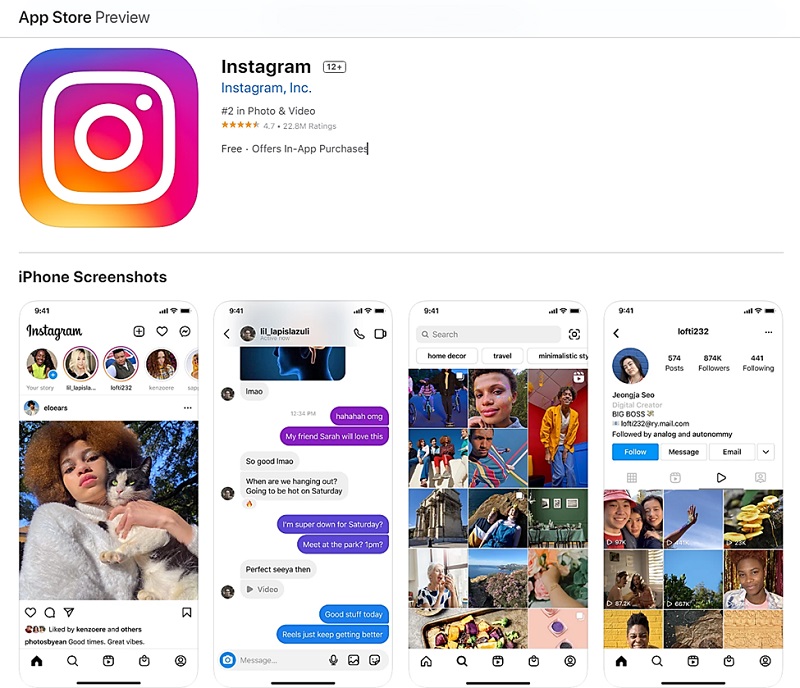
Notice how it tactfully uses the app previews to point out its photo networking capabilities?
It leaves out the rest of its features and focuses on the three most fundamental ones – connecting friends, social messaging, and photo sharing.
#2. Review And Learn From Your Competitors’ App Store Screenshots
In Sun Tzu’s “Art of War” best-seller, the ancient Chinese military general explains that:
“If you understand the enemy and understand yourself, you’ll dominate a hundred battles. If you understand just yourself and not the enemy, you’ll be suffering a defeat for every victory gained. And if you happen to understand neither yourself nor the enemy, you’ll lose every battle”.
Now that’s more the less the same principle that you should employ when it comes to coping with competitors in the App Store. If you seek to outshine their app screenshots, then you ought to sample what they have in the first place.
You could start by performing keyword research on advanced App Store analytics platforms such as App Annie. It’ll point out your biggest competitors, along with their App Store performance metrics.
You can then go ahead and open their respective App Store pages for a deeper qualitative analysis of their respective App Store screenshots.
In particular, you might want to pay attention to the app features they’ve highlighted, the number of screenshots published, the sequence of the arrangement, the design and layout of the screenshots, plus the corresponding conversion tactics.
The overall goal here is to use the competitors’ insights to establish what works in your market segment, compromises that you should avoid, as well as the unique approaches that you could employ in your App Store screenshots.
#3. Don’t Use The Same App Screenshots Across The Google Play Store And Apple Store
If you happen to have published an identical version of the app on the Google Play Store, you might feel tempted to lift the Android app screenshots and then mirror them to the Apple App Store.
The logic would be that since the two app versions are running similar features, you could as well proceed with the same app preview illustrations.
Well, I too admit that such a strategy might seem like a fairly reasonable way to pull two weeds with one yank. I’d probably even give you points for the thought and effort.
But, that’s good as it gets. While mobile app screenshots are critically relevant to user on-page experience as well as App Store Optimization (ASO) across both app stores, it turns out they operate under varying architectures and market conditions.
We’ve already compared the two ranking systems on our in-depth App Store vs Google Play Store post. The research established beyond doubt that the two use varying rules and algorithms for their app store attributes.
Consider the size guidelines for the app screenshots, for instance. Apple and Google have varying resolution and image size requirements for their app store screenshots.
So, chances are, your Google Play Store screenshots might not even sail through Apple’s review team.
And even if it did, the final results would not be identical to the Play Stores because of the difference in market variables. You’d be facing, for instance, a totally different set of competitors and users.
Market research has already proven that while they might share a couple of similarities, iOS and Android users often have varying mannerisms, capabilities, preferences, and results.
Hence, what might seem like a highly impactful screenshot strategy on one of the platforms might end disastrously on the other.
It’s because of these considerations that you’ll find a successful app like Angry Birds 2 running non-identical app screenshots across the two app stores.
Here’s its setup on the Apple App Store:
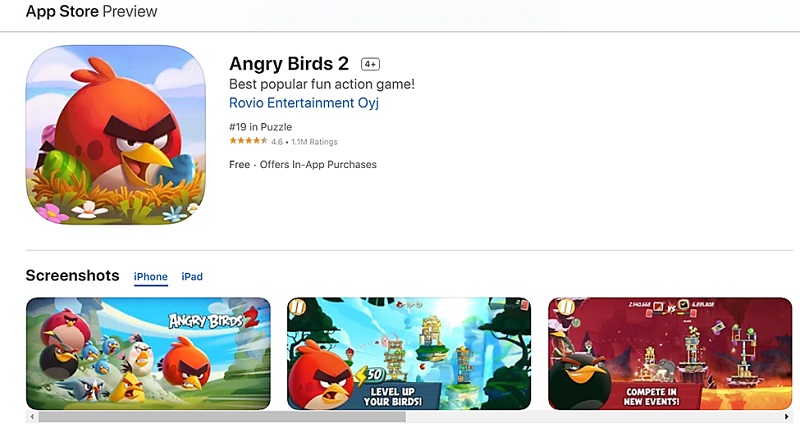
Now, compare and contrast that with the corresponding Google Play Store screenshots…
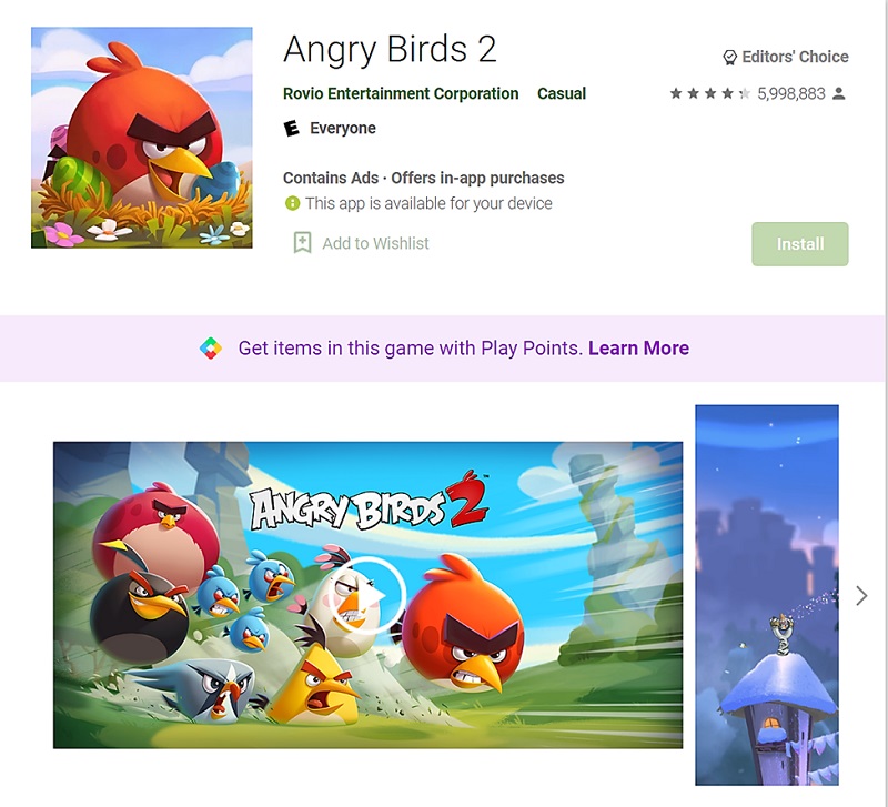
Notice the obvious difference?
#4. Follow All The App Store Screenshots Guidelines
Now that it’s clear that Apple App Store deserves its own exclusive app screenshot strategy, you might want to strictly abide by the laid-out rules while at it.
Yes, that’s right. Apple’s strict review process doesn’t stop at the app level. It extends to cover even the on-page attributes that you’ll be using for App Store Optimization.
The company does this to safeguard its App Store user experience. It seeks to maintain a seamless surfing experience for all the Apple devices accessing the App Store.
You’ll notice, for example, that while Apple insists on a first-person point-of-view, your App Store screenshots shouldn’t include the representation of a hand holding the display. This is prohibited even in gaming apps, where you might want to use hand illustrations to maybe showcase the gameplay controls.
As for the App Store screenshots sizes, it turns out that the images don’t come in a single standard dimension. On the contrary, Apple has distinct size guidelines for each of its gadgets, as they happen to differ in display resolution.
iPad apps, for example, have their own exclusive screenshot optimizations – which are evaluated separately from the submissions made for Apple Watch apps, iPhone apps, Apple TV apps, and so forth.
But, the drama doesn’t end there. In addition to separating the screenshots by device, Apple goes ahead and defines even the dimensions required for each of its gadgets’ displays.
This makes things a bit cumbersome for app publishers, as they’re expected to submit app screenshots for all their targetted device models.
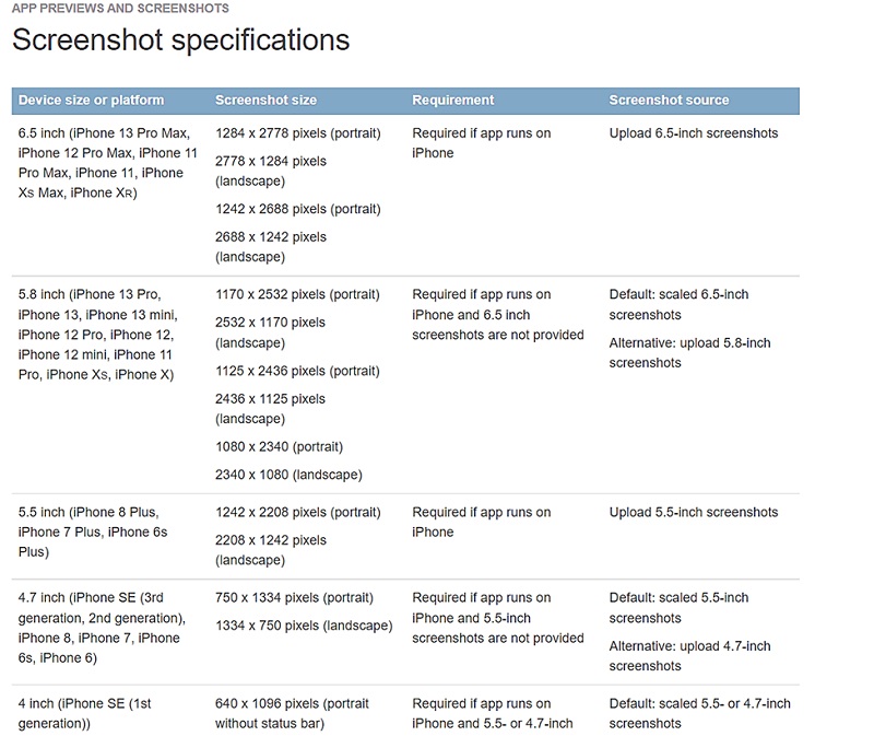
Say, for example, that you’re launching an iPhone app on the iOS App Store. Apple will check to confirm that you’ve followed the App Store screenshots size guidelines for the iPhone XS Max, iPhone XS, iPhone 8, iPhone 7, and iPhone 6.
Here are the size details for each of these subclasses:
- The 6.5-inch display on the iPhone XS Max and iPhone XR: requires 2688 px by 1242px for landscape-oriented screenshots, and 1242px by 2688px for portrait-oriented app screenshots.
- The 5.8-inch display on the iPhone X Max and iPhone XS: requires 2436px by 1125px for landscape-oriented screenshots, and 1125px by 2436px for portrait-oriented app screenshots.
- The 5.5-inch display on the iPhone 6, iPhone 7, and iPhone 8: requires 2208px by 1242px for landscape-oriented screenshots, and 1242px X 2208px for portrait-oriented app screenshots.
This is the same level of differentiation even when it comes to the Apple iPad, Apple Watch, Apple TV, and MacBook.
For example, the 9.7-inch display on the iPad Mini has different size requirements from the app screenshots targeting the 10.5-inch display iPad Pro, the 11-inch iPad Pro, or the 12.9-inch Retina display on the second and third generations of the iPad Pro.
Here is a breakdown of all these App Store screenshots size guidelines, as published by Apple in 2025:
Otherwise, if you’re torn between landscape and portrait modes, the best strategy would be to choose based on the layout of your mobile app’s interface, as well as the features you seek to showcase.
A majority of the mobile apps tend to stick with portrait since it provides the most realistic outlook of their user interface. Landscape, on the other hand, is often used by mobile gaming apps and maybe entertainment apps like Netflix.
It’s also worth noting that orientation influences not just the arrangement of the screenshots, but also the appearance of your mobile app on the App Store search results.
Apps with portrait-oriented screenshots provide a sneak peek of up to three assets, all of which are viewable right from the search results listing. Landscape orientation, on the other hand, limits the viewable assets to one.
So, if you’d like to drive mobile app downloads directly from the App Store search results, your best bet would be with the portrait orientation.
#5. Capitalize On App Screenshots Makers, Templates, and Mockups
No, you don’t need advanced graphic design skills to come up with elegant App Store screenshots. Even Photoshop itself might not be necessary at all.
You see, the good thing is, that there are now plenty of simple automated design tools and resources that you could use to build everything from the ground up.
They won’t even cost you that much – as many of the tools are favorably priced, while others are generous enough to offer their design functionalities, templates, and mockups for free.
You could, for instance, sample the likes of Screenshot Maker Pro and LaunchMatic – both of which happen to be great app screenshot generators. Their intelligent design features will help you seamlessly quickly create and customize all the visuals – without the need for any advanced technical skills.
Otherwise, you could also try out the elegant App Store screenshot templates and mockups that are offered by AI-driven design powerhouses such as PlaceIt. This is where you go to save yourself the trouble of designing everything from scratch.
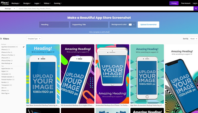
You just need to pick your desired app screenshot template and then customize its attributes based on your brand and App Store campaign strategy.
#6. Customize App Screenshots With User-Oriented Design Principles.
When it comes to customizing the app store screenshots, you might want to strictly adhere to user-oriented design principles. This means tweaking the assets and visuals in a manner that prioritizes user needs above everything else.
All the App Store screenshots should be strategically optimized to offer your audiences a smooth and well-streamlined user experience. This makes it easy for them to figure out not only the fundamental functionalities but also the value that comes with the app.
One of the design principles that you could use to achieve that is minimizing clutter. You ought to avoid overwhelming your prospects with way too many illustrations and text. The neater you keep the whole layout, the better you’ll be able to engage and convert prospects.
Market research, in fact, shows that as much as 64% of consumers would be open to spending more for simpler experiences. Plus, 61% of them are more likely to recommend brands that offer simpler experiences.
That said, you might also want to stay away from stock photography, as it would compromise the authenticity of your mobile app and brand.
A good example of an app that has designed its screenshots with user experience in mind is Uber.
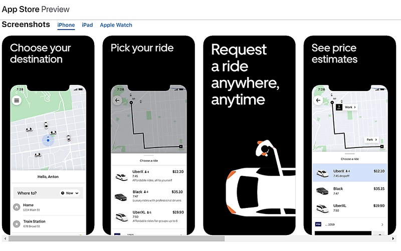
Its App Store screenshots have been structured to make everything as straightforward as possible. It only takes a couple of seconds to figure out what the mobile app is about, and how it stands to benefit you.
#7. Tell A Story By Logically Organizing The Assets
The caliber of App Store users today doesn’t have the patience to sit through complex or confusing media. What’s more, their over-digitized lifestyle has now shortened their attention span to the point of even falling behind goldfish. You can expect them to spend no more than eight seconds on your mobile app screenshots.
Of course, this makes them particularly hard to please. If you hope to engage them long enough to drive app installs, then you need to keep everything simple and rational. All the screenshots ought to be adequately clear and sensible.
This is where bring your A-game in design and asset sequencing. The objective is to find the right screenshot visuals for telling a captivating story that logically communicates the real value of the mobile app.
The first app screenshot could, for example, act as the hook. It should pull the audience with visually arresting characters that not only explain the primary purpose of the app, but also double up as curiosity triggers.
As for the rest of the App Store screenshots, try to spice them up with artistic overlays of interface illustrations, in a manner that showcases the supporting capabilities of the mobile app.
With that done, the final move would be to arrange the resultant screenshot creations in the order that users would sample your app’s features in their natural sequence.
For example, you could have the home page as the first screenshot, before following it up with the supplementary pages. This pieces the content together in a way that’s both cohesive and rational.
TikTok has achieved it quite beautifully on the App Store.
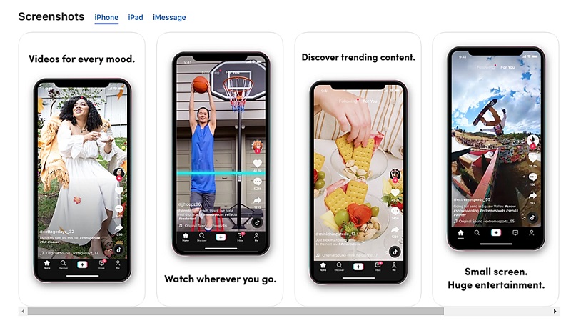
Its first app screenshot pulls you with a playful showcase of the Home section, which then ushers you to the adjacent logically-sequenced assets.
#8. Highlight The App’s Value By Embedding Captions
App Store screenshots are not restricted to graphical illustrations. At least Apple is flexible enough to support even text overlays on its app screenshots.
And yes, of course, there are many ways that you could leverage the text. But, that doesn’t give you the license to bombard your prospects with all sorts of feature descriptions.
Remember that it’s not really about how much you can tell about the app. Rather, it’s more about what you actually manage to tell about the app.
You could, for example, pick out one core feature per screenshot to highlight. Or, better yet, use the text to strategically highlight the value that app users can expect from your mobile app.
The perfect App Store screenshots should contain one-liners that emphasize the focal points of your app’s interface and functionality.
Here’s a word of caution, though. Try to avoid a salesy language.
The text shouldn’t come off as a hard sell. Rather, keep everything concise but appealing. And while you’re at it, maintain an attitude that naturally matches the theme and category of your mobile app – whether witty, emotive, approachable, funny, or professional.
Here’s a great example by Snapchat…
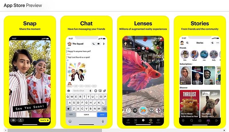
Notice how the app tactfully uses one-liners to explain its principal value across each screenshot?
Consider the text embedded on its first screenshot, for example. “Snap, Share the moment” is a simple but concise statement that highlights what the mobile app is all about.
And the same applies to the rest of Snapchat’s screenshots. In a playful but informative manner, they all communicate essential information on the purpose and value of the app.
#9. Localize The Mobile Screenshots Across Your Targetted Regions
Localization applies to global apps that are targeting users from different regions and countries across the world.
To facilitate multi-regional growth, Apple allows gives such app publishers a holistic App Store framework for targeting different territories. You basically get to run multiple parallel versions of your App Store page, each in its own unique language.
As for the App Store screenshots, the platform allows you to set up to 10 assets per device size across each language.
Sounds burdensome all right – but you’ll ultimately appreciate the huge app growth potential it presents. Every single region that you localize the app for translates into a whole new market of prospects.
So, you might want to capitalize on all the available opportunities.
If you’re targeting France, for instance, you’ll have to recreate and retweak the app screenshots in French. This should be repeated across all the languages that you’ve published your mobile app in.
WhatsApp, the web messaging service owned by Facebook, is one of the many apps that have used the privilege to expand their global dominance.
In the French version of the App Store, for instance, you’ll find all its page elements – including app screenshots – localized specifically for French-speaking users.
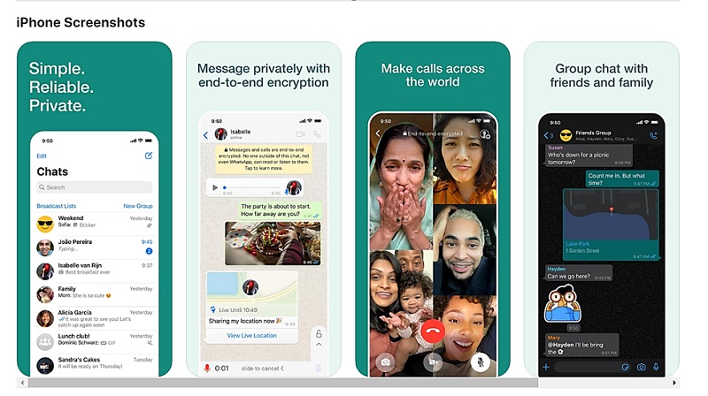
Now, compare that with its English equivalent…
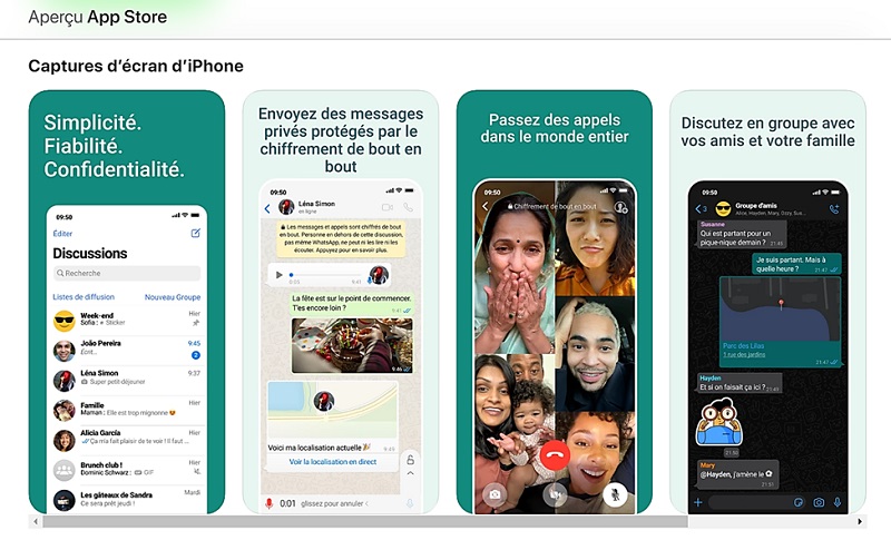
It turns out that the two sets of App Store screenshots are identical in every possible way, with the language being the only difference.
So, I guess that should confirm it for you. That you can go ahead and localize the same set of screenshots for various territories.
Key Takeaways
To cap it all off, here are the main pointers that you should keep in mind when it comes to perfecting App Store screenshots.
- You’re already competing for user attention against more than 2.22 million other iOS apps, and the number of mobile apps in the App Store is still expanding by the tens of thousands every month.
- The free AppReport platform generates App Store Optimization (ASO) intelligence for your mobile app. You can count on it to quantitatively audit even your App Store screenshots, and then flag up any major technical issues that might be compromising your App Store rankings.
- App screenshots are the “most influential” user-oriented element on your App Store page.
- Apple itself has structured the iOS screenshot gallery as the most prominent asset of the page. This is what will greet your prospective mobile users when they first land on your App Store page.
- App Store screenshots take up about 75% of the App Store landing page. That means that they form a huge part of your app’s first impression.
- You need just to come up with just five or so of the biggest strengths. Otherwise, adding needless functions will only confuse your prospects.
- The human brain is naturally wired to pick out and focus on only a few things at a time, while ignoring other bits of information. So, to engage prospects accordingly, remember to keep your App Store screenshots as simple as possible
- To identify your biggest competitors, perform keyword research on advanced App Store analytics platforms such as App Annie.
- While mobile app screenshots are critically relevant to user on-page experience as well as App Store Optimization (ASO) across both app stores, it turns out they operate under varying architectures and market conditions.
- Apple and Google have varying resolution and image size requirements for their app store screenshots.
- While they might share a couple of similarities, iOS and Android users often have varying mannerisms, capabilities, preferences, and results.
- While Apple insists on a first-person point-of-view, your App Store screenshots shouldn’t include the representation of a hand holding the display.
- Apple has distinct size guidelines for each of its gadgets, as they happen to differ in display resolution.
- If you’re torn between landscape and portrait modes, the best strategy would be to choose based on the layout of your mobile app’s interface, as well as the features you seek to showcase.
- Orientation influences not just the arrangement of the screenshots, but also the appearance of your mobile app on the App Store search results.
- On the App Store search results pages, portrait-oriented screenshots provide a sneak peek of up to three assets, whereas landscape orientation limits the viewable assets to one.
- There are now plenty of simple automated design tools and resources that you could use to design and build your App Store screenshots from scratch.
- All the App Store screenshots should be strategically optimized to offer your audiences a smooth and well-streamlined user experience.
- 64% of consumers would be open to spending more for simpler experiences, and 61% of them are more likely to recommend brands that offer simpler experiences.
- You might also want to stay away from stock photography, as it would compromise the authenticity of your mobile app and brand.
- You can expect users to spend no more than eight seconds on your mobile app screenshots.
- Find the right screenshot visuals for telling a captivating story that logically communicates the real value of the mobile app.
- Screenshots ought to be arranged in the order that users would sample your app’s features in their natural sequence.
- Apple is flexible enough to support even text overlays on its app screenshots.
- It’s not really about how much you can tell about the app. Rather, it’s more about what you actually manage to tell about the app.
- The perfect App Store screenshots should contain one-liners that emphasize the focal points of your app’s interface and functionality.
- Apple allows you to set up to 10 screenshot assets per device size across each language version.
- You can go ahead and localize the same set of app screenshots for different App Store regions.
Over To You
Now, remember that, with all these optimization factors considered, it ultimately comes down to how well your App Store screenshots have been designed.
Whatever looks the best, sells the best – as consumers are instinctively driven to pick out the most beautiful options.
So, it goes without saying that, if you present an App Store prospect with app screenshots that are visually striking and informative, then the odds for conversion would be in your favor.
But, get this. To sustain a consistent growth in App Store traffic, app downloads, and app success, then you need to combine the attractive designs with strategic App Store Optimization (ASO) strategies.
To find out how, feel free to contact the mobile app marketing experts at PreApps. We specialize in not just app screenshots, but also the rest of the App Store page elements. So, you can trust us with your entire App Store Optimization strategy.
Newsletter
Don’t miss a thing! Sign up to receive daily news
Subscribe Newsletter


